At the beginning of 2019, OPPO was struggling with software despite enjoying a lot of success with its smartphones. This was because older versions of its custom user interface, ColorOS, were detrimentally affected by iOS-inspired design patterns that led to usability issues in international markets. ColorOS was generally seen as a factor that held back OPPO smartphones, as well as the online-only Realme brand.
To rectify the situation, OPPO released ColorOS 6.0, based on Android 9 Pie, in April. We commented upon the software’s merits and shortcomings in our OPPO Reno 10x Zoom, Realme 3 Pro, and Realme 5 Pro reviews. It represented a significant improvement, as the company had added long-missing features such as an app drawer in the launcher, better organization of toggles in the notification drawer, and more. However, the custom UI had some drawbacks such as the poor aesthetic choice of the color scheme of the notifications drawer as well as the functional lack of support for Android’s useful notification channels feature. Something as simple as the battery stats menu was poorly implemented, as users could not view the screen-on time of the display or detailed power usage of individual apps. OPPO had come a long way in terms of user experience, but there was still some way to go.
Android 10 was released in September, and thanks to Project Treble, its adoption in 2019’s smartphones should be higher than Android 9’s adoption was last year. We have seen OnePlus and Xiaomi release stable updates of Android 10 for a few of their phones, while Samsung and LG have started beta updates. OPPO, too, joined the beta update train by providing a trial version of Android 10-based ColorOS 6.7 for the standard first-generation OPPO Reno variant. ColorOS 6.7 will roll out to the OPPO Reno 10x Zoom and the OPPO Reno 2 before the end of the year.
I have been testing this for the past few days on the standard OPPO Reno, so let’s see if OPPO’s flavor of Android 10 can help to close the gap with user interfaces made by the likes of OnePlus, Samsung, Xiaomi, and Huawei. In terms of speed, OnePlus’ OxygenOS is generally held as the class leader, while in terms of features, Samsung, Xiaomi, and Huawei are seen to have the most feature-rich user interfaces. Can ColorOS 6.7 close the gap to the top contenders? That is one of the main questions we are attempting to answer in this review.
This article will attempt to be an in-depth review of ColorOS as a whole.
About this review: I have been using a trial version of Android 10-based ColorOS 6.7 on the first-generation OPPO Reno, which was loaned by OPPO.
The Good
- More minimalist UI
- Full support for Android’s notification features
- ColorOS 6.7 has a better dark mode implementation than Google’s stock Android and works for many third party apps
- Rich feature-set that can go head-to-head with top user Android custom interfaces
The Bad
- No mute mode without vibration
- ColorOS 6.7 still has a lot of bloatware, including region-specific bloatware
The Design of ColorOS 6.7
ColorOS 6.7 brings a new design for the notifications drawer and the quick settings menu, which is subjectively much better. The notifications drawer in ColorOS 6.0 was visually busy, with two different contrasting colors for active toggles. To make matters worse, the colors themselves were bright shades of blue and green instead of the the neutral color scheme of Android 9 and Android 10, that uses a toned down shade of blue. The toggles themselves were arranged in blocks which, in my opinion, also made for an old-fashioned aesthetic. Lastly, the notification center used a transparency effect. While that wasn’t poor in itself, it did lead to absence of minimalism.


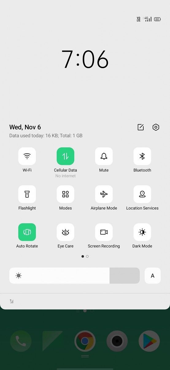
In ColorOS 6.7, on the other hand, OPPO uses a single shade of green in the notifications drawer and the quick settings menu. The shade of green is still a bit too bright for my liking, but there is no denying that it works much better than the contrasting dual-color scheme of ColorOS 6.0. The removal of the blocks also leads to a more minimalist look. The toggles themselves are rounded squares or “squircles,” and they have interesting iconography: it is starkly 2D, starkly minimalist. It fits well with a 2019 smartphone user interface, and it looks quite good. Another change from ColorOS 6.0 is that OPPO has a data usage counter enabled by default in the notification center in ColorOS 6.7.
While OPPO hasn’t gone quite as far as Samsung to improve one-handed phone use, the quick settings toggles are indeed shifted towards the middle of the display to make it easier to reach for them while using the phone one-handed. There is a huge clock in the top section, reminiscent of what’s found in One UI. It’s a shame that we don’t see this design philosophy being replicated in every ColorOS 6.7 system app, though. The new clock font follows the same minimalist design philosophy of the quick settings toggles by using a thin font weight. Google’s flavor of Android 10 in the Google Pixels has moved to Google Sans in Android 10, but Roboto still works very well as a body font. Device makers can’t use Google Sans because it is a proprietary font.
The iconography of the launcher still remains inconsistent. Apps like Phone and Camera have circular icons, matching the old Play Store guidelines (according to the new guidelines, apps should now have squircle icons), but other apps such as Photos, File Manager, Contacts, Calculator, and others are still square. This is a minor nitpick, as quite a few other manufacturer user interfaces also suffer from the same issue. Nevertheless, OPPO should move towards the standardized icon format for visual consistency.
The defining word that sums up ColorOS 6.7’s new design is “minimalist”. The minimalist philosophy is seen in the system apps, in the phone call UI, in the quick settings toggles, and in the settings app. OPPO’s Settings app still isn’t laid out intuitively – for example, navigation gestures are contained inside the “Convenience Aid” menu, which isn’t where they normally are in other user interfaces. On the other hand, ColorOS does have a huge number of features, so it was always going to be a challenge for any device maker of a feature-rich UI to present them in an intuitive manner. ColorOS is actually better than One UI in this respect.
Ultimately, the refreshed design of ColorOS 6.7 is one of the better designs in custom Android skins. It doesn’t opt to use a blur-focused UI such as MIUI or EMUI 10, and that makes it fit better with Google’s Material Theme design language. It’s inoffensive, and it gets out of the way.
Features of ColorOS 6.7
Launcher
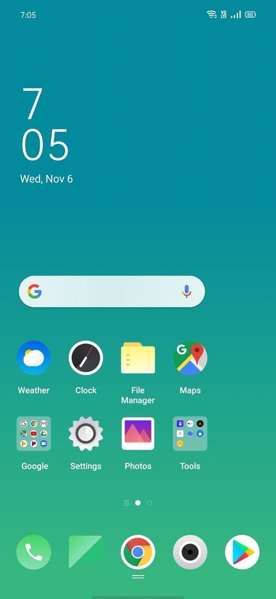


The launcher of ColorOS 6.7 is one of the better system launchers out there. By default, the home screen mode is set to “Drawer Mode”, which means that it comes with an app drawer enabled by default. This is a good decision. OPPO also correctly implements the swipe up to access app drawer gesture. The home screen layout can be changed between 4×6 and 5×6 rows and columns. The swipe down on home screen gesture is set by default to open Global Search, but users can change it to open the notification center instead. I personally found the latter option a lot more convenient.
Users can adjust the app startup and closing animation speed from “Fast” to “Normal”. They can also choose whether to automatically add new downloaded apps to the home screen or not. There are a few transition effects to choose from on the home screen. The app drawer shows a row of predicted apps by default, but this can be disabled in the home screen settings menu. The app drawer scrolling is as fast and smooth as it should be, and I had no issues here. The other home screen modes are “Standard mode” (no app drawer) and “Simple mode” respectively. The simple mode contains much bigger icons, as expected. The launcher doesn’t support Google Discover feed integration. Instead, it has a smart assistant feature that is more relevant for users in China. Finally, the “Lock screen magazine” feature (that is enabled by default) cycles through OPPO’s selection of wallpapers throughout the day.
One handed mode
One-handed mode is a popular feature in custom Android skins, and it’s easy to see why, as display sizes have shot to 6+ inches in 2018 and 2019. For some reason, this feature still doesn’t exist in stock Android.
The one handed mode of ColorOS functions like the other one handed modes present in other custom Android skins, and it differs from Apple’s Reachability mode as well as XDA’s One Handed Mode app. The only problem here is that OPPO’s one handed mode can’t be accessed with a navigation gesture. It can only be accessed through the toggle in the quick settings menu, which OPPO calls the control center.
Notifications
 Notifications in stock Android are great. This is the reason why stock-based user interfaces such as OxygenOS opt not to meddle with Android’s notification feature. ColorOS 6.0, however, didn’t have an optimal handling of notifications. It didn’t support Android 8.0 Oreo’s notification channels and notifications snoozing features. Notification channels is a useful feature that lets users disable notifications for different categories of an app, while notification snoozing lets users temporarily snooze a heads-up notification by swiping up on it. Android 9 also added suggestion replies to the notification center. This was first introduced in Google Allo, but now it has made its way to Android Messages as well as quite a few other Google apps. In Android 9, suggested replies required apps to support them, whereas in Android 10, the system can automatically generate suggested replies if the app doesn’t opt out of them.
ColorOS 6.7 adds support for all three notification-handling features. Users can now disable notifications for some categories of an app, while keeping enabled the other notification categories. This level of granular control is good to have, and ColorOS 6.7 finally achieves parity with stock Android in this regard. Suggested replies aren’t always useful, but there is no real harm in including it.
ColorOS 6.7 also has a real-time network speed indicator on the status bar. It saves the need to download a third-party app on the Play Store.
Display features: Dark mode and Screen-off clock (Always-on Display)

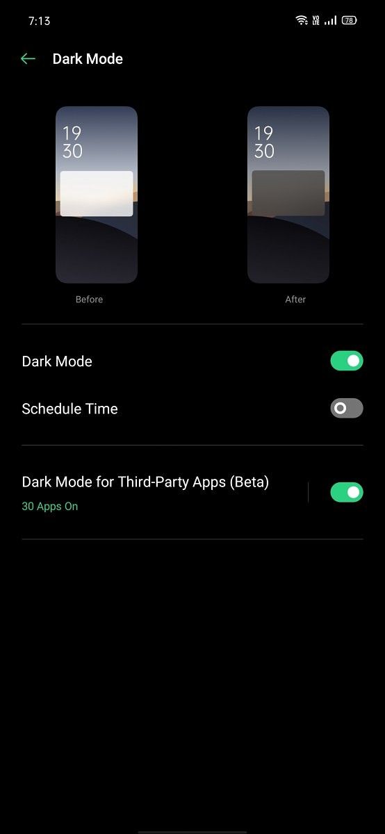
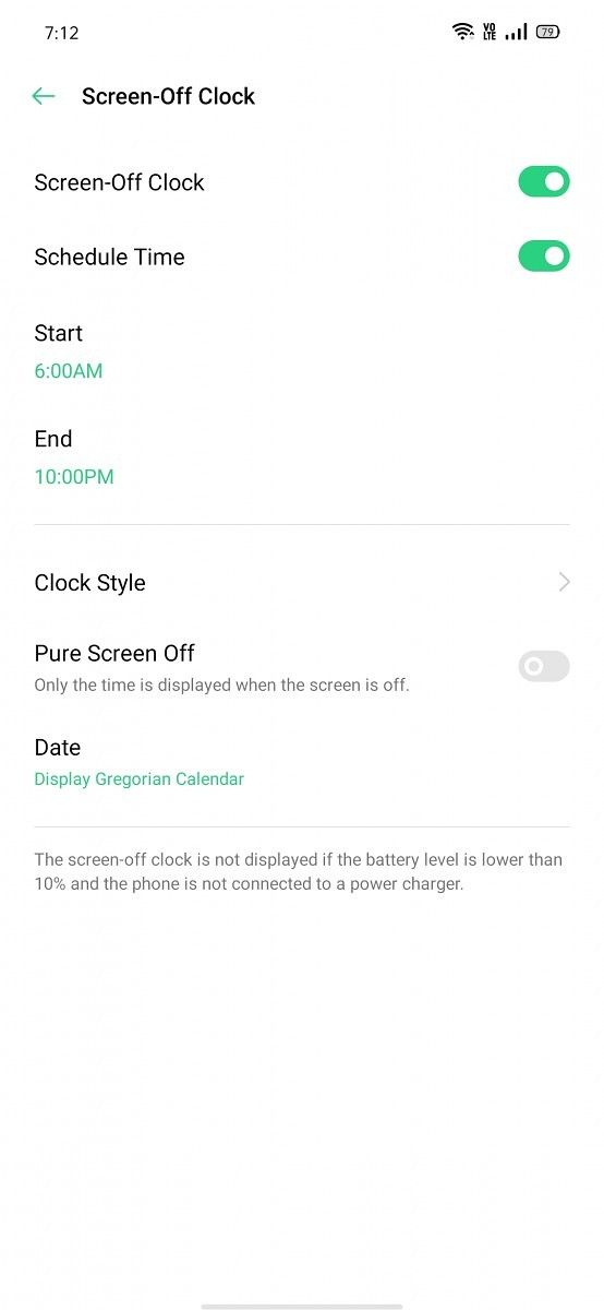

In the display settings, ColorOS 6.7 adds support for Android 10’s dark mode. Dark mode found its way to stock Android in the Android 10 update. Google has since updated nearly every Google app with an in-built dark mode. ColorOS 6.0 didn’t have a dark mode, so it’s good to see OPPO integrating a flagship Android 10 feature.
Dark mode works as well as users have come to expect. Its true benefit is for users using phones with AMOLED displays, and OPPO’s flagship phones as well as mid-range phones now have AMOLED displays. Phones with AMOLED displays will get better battery life with dark mode enabled, thanks to the higher power efficiency at lower Average Picture Levels (APLs). ColorOS 6.7’s dark mode can be scheduled according to time, whereas stock Android doesn’t allow this, so this is a ColorOS addition. The dark mode in ColorOS works for all first-party OPPO apps as well as supported Google apps. Interestingly, ColorOS 6.7 includes a beta feature that lets dark mode work for third-party apps. In stock Android 10, this is available as a Developer Option, but ColorOS 6.7 is making it more accessible. The dark mode in ColorOS 6.7 also works for more third-party apps as compared to Android 10’s option. Overall, this makes it better than the one in stock Android 10.
The next display feature is screen-off clock, OPPO’s name for the popular always-on display feature. While OxygenOS still doesn’t have support for an always-on display, OPPO has had support for it since a while. The screen-off clock can be customized with two digital and one analog clock style. The feature can be scheduled according to time to save battery life. It’s not the richest implementation of always-on display that we have seen (One UI is still at the top here), but OPPO’s approach does show the battery level on the always-on display, which is a plus point.
Convenience Aid
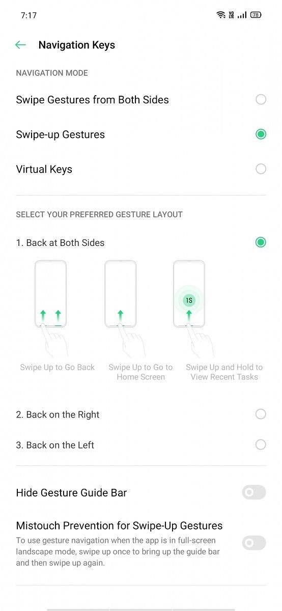
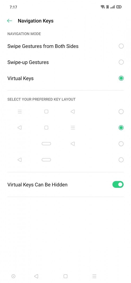
The best feature of ColorOS is its navigation system, which offers unparalleled levels of customization. Users can choose from the following three types of main navigation systems:
- 3-button navigation: Google is standardizing on Android 10’s navigation gestures and 3-button navigation for Android 10 phones. 3-button navigation remains the default navigation system on Android, but stock Android doesn’t allow users to customize the navigation bar. ColorOS comes to the rescue by providing options to change the order of the buttons in the navigation bar. Users can also add a hide navigation bar button, which is neat as stock Android still requires ADB to accomplish the same. Android 9’s 2-button navigation, which was deprecated with Android 10, is no longer included in ColorOS 6.7. (It was found in ColorOS 6.0.)
- Swipe gestures from both sides: This is OPPO’s implementation of Android 10’s gesture navigation system. To go home, users swipe up from the bottom. To go back, users can swipe from both sides of the display, while swiping up from the bottom and holding will access the recent apps menu. The difference from stock Android 10’s implementation is that OPPO allows users to hide the gesture guide bar, while Google doesn’t. This saves some screen real estate at the cost of being a bit less intuitive, but this option is disabled by default. To switch to the previous app, users have to slide inward from both sides of the display and then hold. As expected, mistouch prevention for swipe gestures from both sides is included.
- Swipe-up gestures: In the newest ColorOS 6.7 beta, this option is hidden behind a sub-menu, because of Google’s focus on side swipe gesture system in Android 10 as well as the need to avoid fragmentation. The back gesture here is accessed by swiping up at the corners. OPPO allows customization by allowing users to choose to have the back gesture trigger from both sides, or only the right or left side. The gesture guide bar can be hidden here as well.
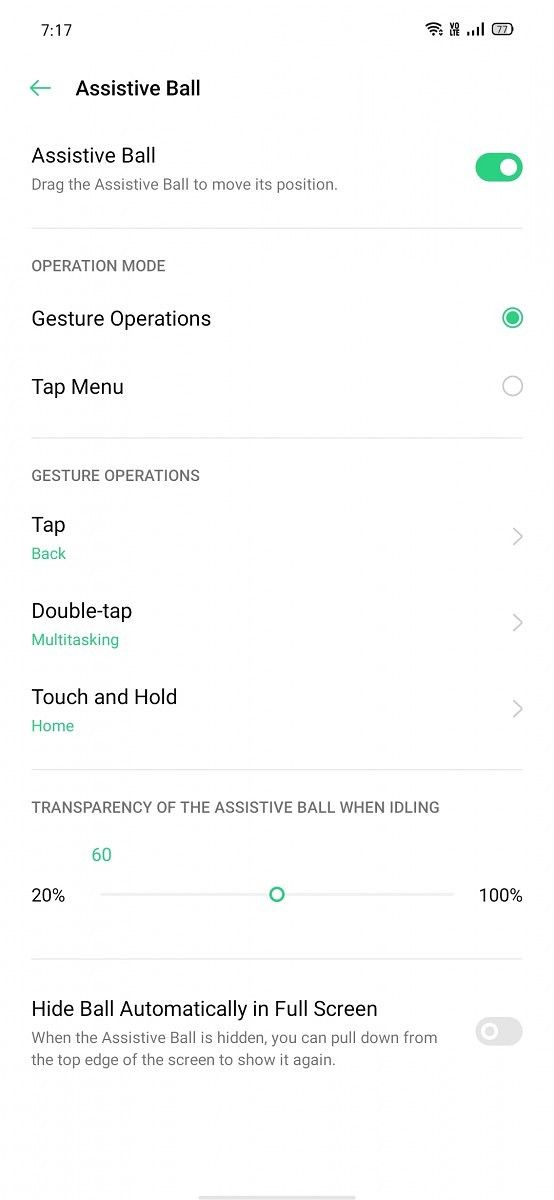
OPPO also includes pie gestures in the form of “Assistive Ball”. The gesture operations for the ball can be customized, and its transparency can be adjusted. The operation mode can be changed to “tap menu”, where each gesture operation will be hidden behind a tap on the ball. Users can choose to hide the ball in full screen mode. The assistive ball is obviously disabled by default.
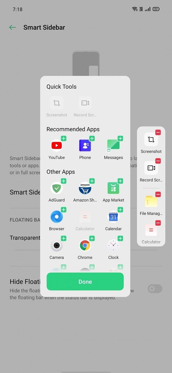
Smart sidebar is a more interesting feature. Users can swipe from the top edge of the right side of the screen to access a sidebar where they can quickly take a screenshot, record the screen, open File Manager or the Calculator, and one more customizable button to open any user app. This is similar to Samsung’s Edge screen feature to launch apps, minus the curved display.
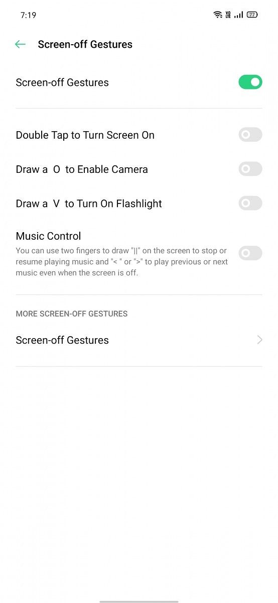
The “Gesture & Motion” menu contains screen-off gestures, wake gestures, and 3-finger screenshot. 3-finger screenshot is such a convenient gesture that it should be included in stock Android, but for now, users can only find it in a custom Android skin. The screen-off gestures are disabled by default and are of limited use considering that most OPPO phones now have fast optical in-display fingerprint sensors, which lets the user quickly jump to the home screen. Nevertheless, users can enable double tap to wake, draw O and V to enable camera and turn on flashlight, and OPPO provides more customization for actions such as sliding left or right, or drawing the M character.
The wake gestures are the usual ones that we have come to expect: raise to wake, auto ear pickup calls, auto switch to ear receiver (this is actually a rare gesture wherein the phone will switch from the speaker to the receiver if the phone is held close to the user’s ear), and flip to mute incoming calls. Most of these gestures have become standard on custom skins, and it’s good to see OPPO including them.






Privacy features
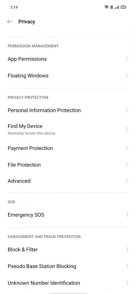
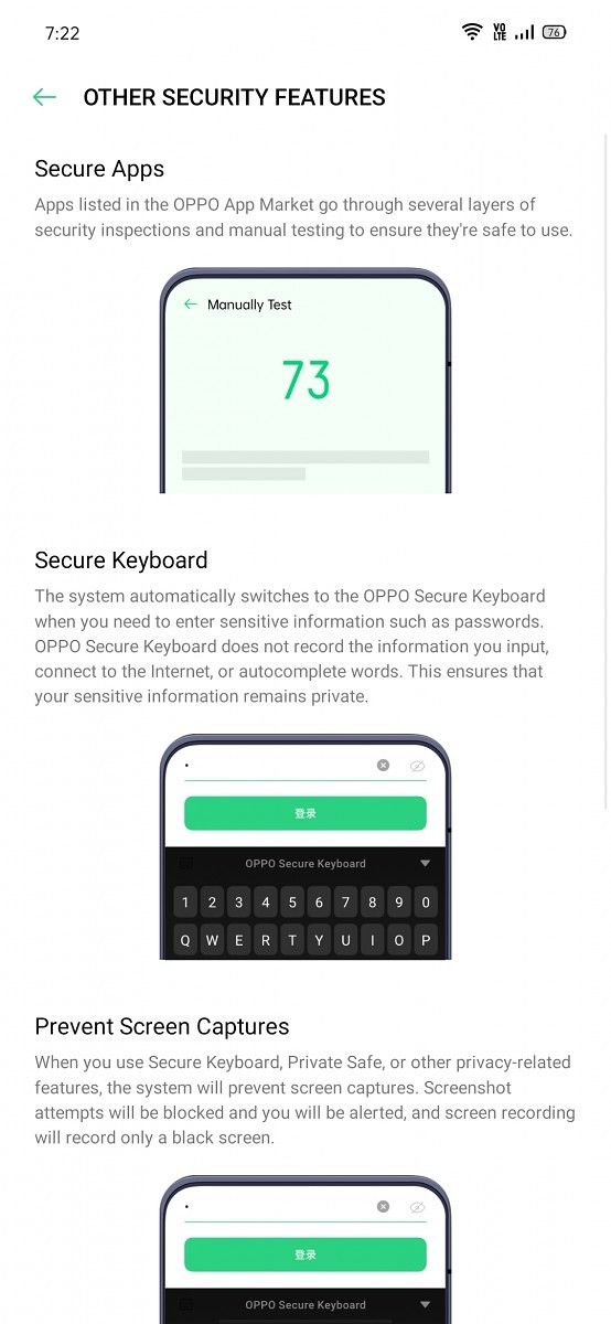
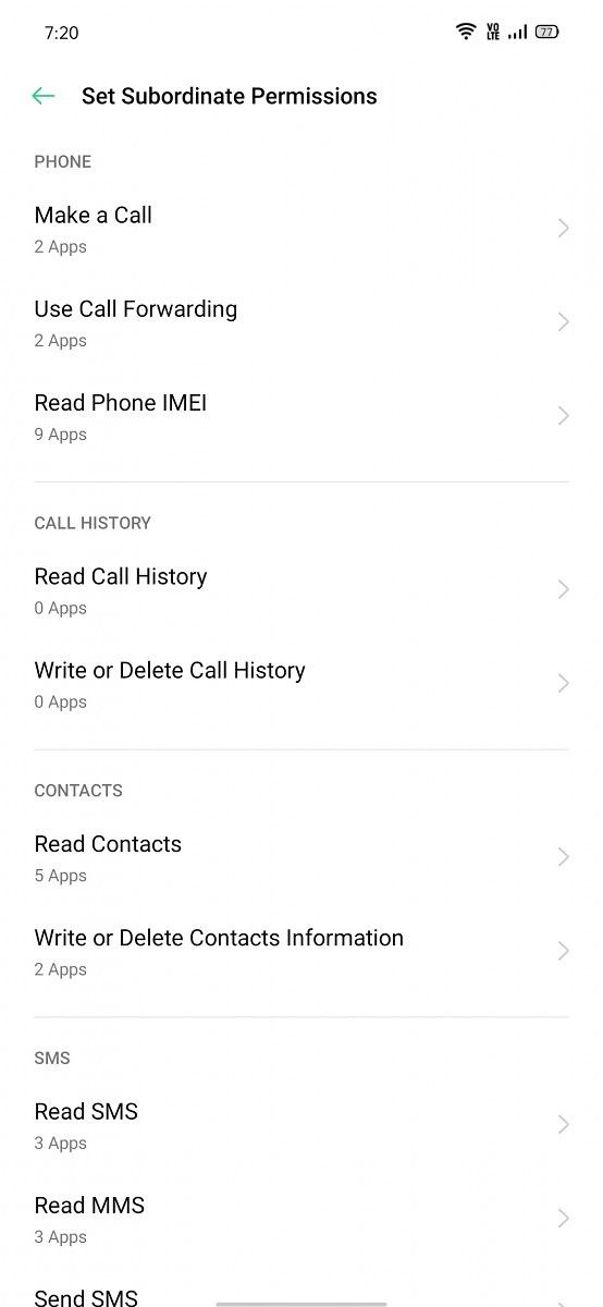
Android 10 comes with quite a few privacy-focused features such as better handling of permissions, building upon the privacy features momentum of Android 9. Not wanting to be left behind, OPPO has added a few of its own features to ColorOS 6.7. The subordinate permissions feature goes deeper than stock Android’s permission management feature by letting users see which apps can read phone IMEI, write or delete contacts information, and more. This comes on top of the permission management improvements added with Android 10, such as granular control of allowing location to be used by apps.
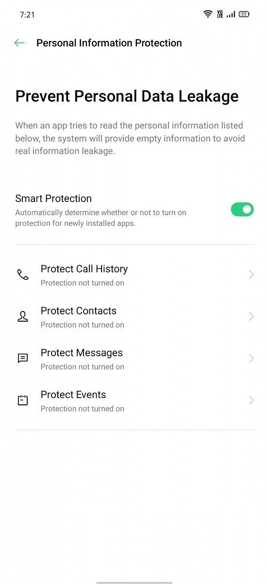
The most interesting privacy-focused feature in ColorOS is “Personal Information Protection”. According to OPPO, this feature aims at preventing personal data leakage. How does this feature work? The company states that when app app tries to read the personal information listed below, the system will provide “empty information” to avoid real information leakage. The personal information is in the form of call history, contacts, messages, and calendar events. As far as I can tell, this appears to be a unique feature in Android skins. However, OPPO has disabled it by default – and as it is hidden beneath a settings menu, it’s unlikely that many users will discover it. The smart protection will automatically determine whether or not to turn on protection for newly installed apps. It’s easy to see why OPPO has disabled it by default: this could lead to issues with apps. However, a feature of this kind is needed for privacy-focused users in 2019.
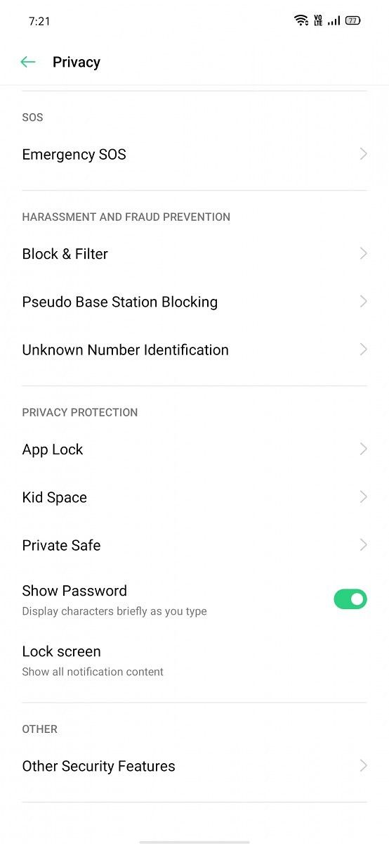
Kid Space is OPPO’s implementation of child mode. Parents can set the duration allowed for each session, the apps allowed to be accessed by their child, and they can even choose to turn off the cellular network. Kid Space isn’t just a generic implementation of an old idea, though; it’s very feature-rich. It prohibits system modification, prevents loss of phone credit, and even tries to “prevent addiction” for children by restricting available apps and restricting the phone usage time.
Private Safe is OPPO’s implementation of Huawei’s PrivateSpace feature. It’s a complement to Android’s existing multi-user system. It can only be accessed if the user has a privacy protection password; pattern unlock will not do the job for this feature. ColorOS also includes App Lock, where the user can lock any user app behind their privacy protection password for an additional layer of security.
The identification of online numbers in calls is a very popular feature these days. In OPPO’s case, even when the feature is disabled, the phone will still identify phone numbers using a local phone number database. OPPO also provides quick actions for calls from unknown numbers in the form of saving the number, adding it to the blacklist, or marking it. ColorOS’ dialer has a blacklist feature, as expected.
ColorOS also uses randomized MAC addresses when probing for new networks while not currently associated with a network. This privacy-focused feature was added in Android Oreo, and in Android 10, MAC randomization is enabled by default for client mode, SoftAp, and Wi-Fi Direct.
OPPO has another feature called “Pseudo Base Station Blocking”. It aims to block criminal base stations that are disguised as the base stations of actual mobile network carriers. Finally, users can join the User Experience Project for ColorOS. In the Device ID & Ads sub-menu of the Privacy settings, they can choose to limit targeted ad tracking and also reset their device ID.




Improvements in Battery Statistics


The battery statistics implementation of ColorOS 6.0 was not a good one – in fact, it was one of the worst out there. This is because OPPO didn’t let users view the unplugged time, the battery graph, or the actual screen-on time of the display, three basic metrics that are available in the battery statistics menu of stock Android and nearly every other custom Android user interface. The detailed power usage statistics of apps was also not available. Screen-on time counters in apps such as GSam Battery Monitor were broken as well, which was a problem when trying to evaluate battery life.
ColorOS 6.7 fixes all of these issues. Used time is now shown, as well as screen-on time. The predicted time for how long the battery will last is also shown in the battery statistics. Users can also view detailed power usage statistics of apps to determine which of them are causing the battery to drain quickly in any such situation. In the Power Saver options, there is an option for “Sleep Standby optimization”, which is enabled by default. OPPO warns that app notifications may be delayed as the phone is running in low power mode. Despite this, I was not affected by any such issues, and ColorOS 6.7 actually seems better than OxygenOS on the OnePlus 7 Pro in terms of battery management and the issue of timely notifications. In the same way, the memory management policies of ColorOS seem better than those of OxygenOS, which prioritize battery life over app holding capacity.
Miscellaneous features


- Dolby Atmos: OPPO’s phones come inbuilt with Dolby Atmos, the popular technology that promises a wider sound-stage and audio quality improvements. It’s persistently enabled in speaker mode. In earphone mode, users can choose from four settings: Smart, Movie, Gaming, and Music.
- Screen recording: ColorOS 6.7 features an in-built screen recorder, which can come in handy. The screen recorder is neat in terms of its feature set: users can choose to record video with the front camera at the same time, record screen taps, choose the video resolution (1080p/720p/480p), choose the orientation of generated video, and choose whether to record microphone sound. The microphone sound setting is disabled by default, which seems to point to the screen recorder having the ability to record internal audio.
- Connectivity features: ColorOS 6.7 offers two notable features in the connectivity section. The first feature is “Dual Channel Network Acceleration”. This feature aims to use Wi-Fi and mobile data concurrently for a smoother Internet experience. OPPO notes that this feature “may still incur additional charges even if you have unlimited data plan for certain apps”. The other feature is Wi-Fi tethering. This is different from a portable hotspot, which allows users to share their mobile data connection as a Wi-Fi hotspot. In Wi-Fi tethering, users can share their Wi-Fi connection with other devices. The presence of the feature is welcome.
- Riding mode: This is a specialized form of Do Not Disturb and is intended for cyclists. The “do not disturb riding” settings contain options to allow calls from contacts only, favorite contacts only, anyone, or none. Users can choose to have the phone ring for repeated calls, and there is an enabled option to send a message after a call is rejected.
- Digital Wellbeing and parental controls: With Android 10, the OPPO Reno is the first OPPO phone to feature support for Google’s Digital Wellbeing feature, which was introduced with Android 9. Google now requires Android device makers shipping with GMS to include a solution for Digital Wellbeing and parental controls. This is Google’s implementation, unlike Huawei’s custom Digital Balance feature. Users can use app timers and other tools to keep track of screen time, while parental controls is implemented with Google’s Family Link feature.
- Automatic on/off: If users need to reboot their phones or shut them down during the night, this feature will come useful. It schedules times during when the phone will automatically shut itself down and then reboot itself.
- Startup manager: Every Chinese Android skin has a startup manager. This feature helps to get more battery life. By default, ColorOS will block apps from auto-starting in the background; the funny thing is that Google apps are the most affected. Thankfully, OPPO allows users to turn on the relevant settings in social apps to get messages normally, and users can also switch off every startup block setting that is enabled by default for third-party apps.
- App Cloner: This feature clones apps for dual independent installation. Strangely, this feature does not work on third-party launchers. Users can also clone only up to two apps at the same time; this limitation doesn’t make any sense. A better alternative is to download an app such as Island from the Play Store and make use of Android’s work profile to achieve the same task of cloning apps, but with better functionality.
- Game Space: This is OPPO’s implementation of the gaming mode feature that has found its way to many custom user interfaces recently. It appears to have adequate functionality.
- Recorder: OPPO’s recorder app also has the ability to record calls. Call recording is something that Google disallowed for third-party apps starting with Android 9, so users interested in this feature will be happy to see it in a first-party app.
- Weather: This app doesn’t do anything out-of-the-ordinary. It does look good, however, and it acts as an effective alternative to Google Discover’s weather information.
What can be improved in ColorOS 6.7
ColorOS 6.7 doesn’t have a simple mute mode without vibration. This is a basic feature omission. Android 9 re-added the mute/silent mode, which had been removed in stock Android in Android 5.0 Lollipop. Stock Android 10 now has three sound modes: Ring, Vibrate, and Mute. These sound modes are independent of the “Do Not Disturb” functionality that was introduced in Android Lollipop. However, ColorOS 6.7 only has two sound modes: Ring, and Mute. The mute mode actually acts as a vibrate mode, however. This is strange as it doesn’t match the name of the feature. What this means that without changing Do Not Disturb settings, users can’t set their phone to mute all calls and notifications and not have them vibrate the phone. Other custom user interfaces that use Android 10’s three sound modes are much better in this respect.
The list of bloatware in ColorOS 6.7 could also be reduced. The browser sends too many needless notifications, while third-party apps such as NewsPoint, UC Browser, Helo, and others are bundled in the Indian region. OPPO should simply avoid doing that, as these apps have an annoying habit of cluttering up the notification center with spam notifications. OPPO’s own AppMarket had a habit of sending promotional notifications in ColorOS 6.0, but thankfully, its tendency to do this in ColorOS 6.7 has been reduced.
In terms of performance and animation speed, ColorOS 6.7 is competitive with most custom user interfaces, but still remains a notch below OnePlus’ OxygenOS. This is because OnePlus reduces the stock Android animation speed to execute transitions faster and in turn appear to offer better speed, which works very well, especially in combination with the 90Hz displays that OnePlus now offers across its device lineup. It would be a great deal if OPPO could find a way to make ColorOS seem as fast as OxygenOS.
Conclusion
ColorOS has had a middling reputation among Android enthusiasts, but it’s easy to see that much of this is simply because users have not had the opportunity to try it. Until 2018, OPPO’s phones weren’t available in Western markets, as the brand relied on China, the Indian subcontinent, and Southeast Asia. Over the last couple of years, though, OPPO has become a major international device maker, and the OPPO Reno series has a lot of plus points. The OPPO Reno 10x Zoom still stands out as one of the great 2019 smartphone flagship phones. It’s clear that OPPO is a top-tier hardware player.
With ColorOS 6.0, OPPO had succeeded in reducing the gap to the best Android user interfaces. Now with ColorOS 6.7, the brand has succeeded in making a user interface that genuinely stands head-to-head with the best that Huawei, Samsung, Xiaomi, and OnePlus have to offer. It still has a few deficiencies, but on the other hand, it also has unique features that can’t be matched by the competition. It’s great to see custom Android user interfaces make themselves useful again as we head into 2020.
We thank OPPO for sponsoring XDA. OPPO had minimal involvement in the creation of or the content within this article. In particular, they were consulted for fact-checking. Any opinions expressed are those of the author. Our sponsors help us pay for the many costs associated with running XDA, including servers, developers, writers, and more. While you may see sponsored content alongside Portal content, all of it will be clearly labelled as such. The XDA Portal team will not compromise journalistic integrity by accepting money to write favorably about a company. Our opinion cannot be bought. Sponsored content, advertising, and the XDA Depot are managed by a separate team.
The post OPPO Jumps to Android 10 with ColorOS 6.7 [Review] appeared first on xda-developers.
from xda-developers https://ift.tt/2QmeWdJ
via IFTTT

Aucun commentaire:
Enregistrer un commentaire